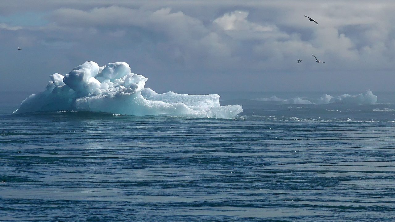
2023 was the warmest year ever recorded and since environmental and climate issues are one of the reasons for starting this site, it’s time to start working. Here, we’ll use R to download and plot a few basic climate realted data sets. R scripts included.
CO2 levels 1974-2024
The most well known greenhouse gas. Data from https://gml.noaa.gov/ccgg/trends/data.html.
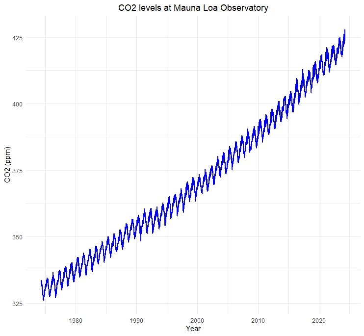
The trend seems clear. I´m not saying it´s bad news, but it´s bad news.
# Data from https://gml.noaa.gov/ccgg/trends/data.html

# Load libraries
library(ggplot2)

# Set working directory
setwd("C:\\Eget\\R\\")

# Read CO2 data and create column names
url <- "https://gml.noaa.gov/webdata/ccgg/trends/co2/co2_daily_mlo.txt"
data <- read.table(url, skip = 34, col.names = c("year", "month", "day", "decimal", "CO2_molfrac"))

# Create column "Date"using YYYY-MM-DD
data$Date <- as.Date(paste(data$year, data$month, data$day, sep = "-"))

# Create plot
ggplot(data, aes(x = Date, y = CO2_molfrac)) +
  geom_line(color = "blue", size = 1.0) +
  labs(title = "CO2 concentration at Mauna Loa Observatory",
       x = "Datum",
       y = "CO2 (ppm)") +
  theme_minimal() +
  theme(plot.title = element_text(hjust = 0.5))
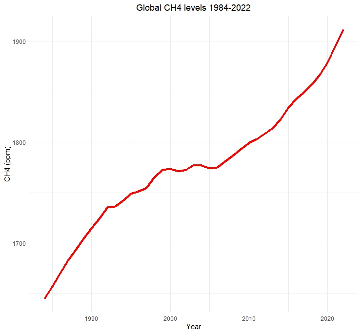
CH4 levels 1984-2022
Methane is more a potent greenhouse gas than CO2, but also resides for a shorter period of time in the atmosphere.
# Data from https://gml.noaa.gov/ccgg/trends_ch4/

# Load libraries
library(ggplot2)

# Set working directory
setwd("C:\\Eget\\R\\")

# Read CH4 data and create column names
url <- "https://gml.noaa.gov/webdata/ccgg/trends/ch4/ch4_annmean_gl.txt"
data <- read.table(url, skip = 46, col.names = c("year", "mean", "unc"))

# Create plot
ggplot(data, aes(x = year, y = mean)) +
  geom_line(color = "red", size = 1.5) +
  labs(title = "Global CH4 concentration",
       x = "Year",
       y = "CH4 (ppm)") +
  theme_minimal() +
  theme(plot.title = element_text(hjust = 0.5))
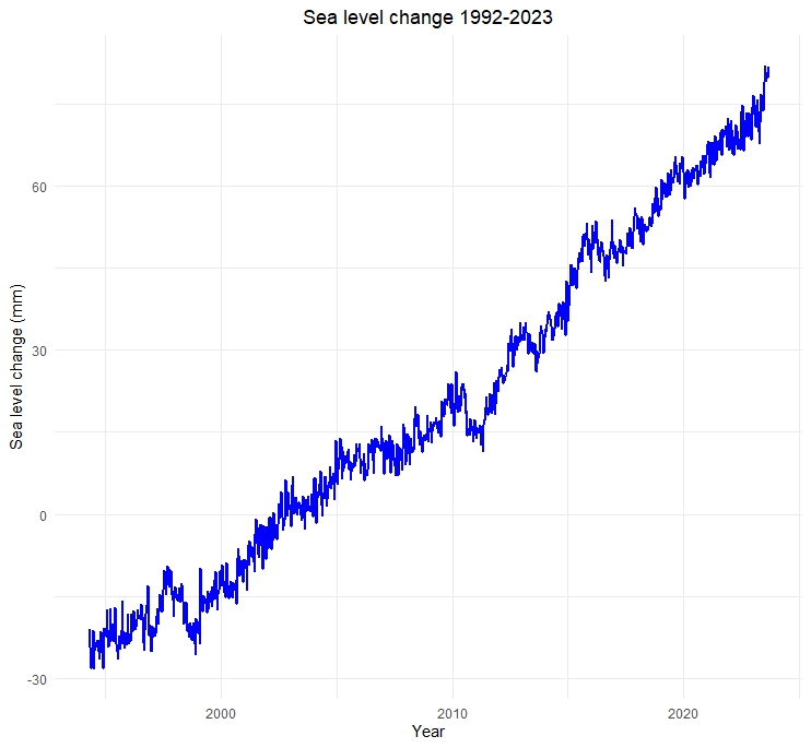
Sea level change 1992-2023
Data from https://sealevel.colorado.edu/ shows a sea level rise of about 11 cm for the period 1992-2023.
# Data from https://sealevel.colorado.edu/files/2023_rel2/gmsl_2023rel2_seasons_rmvd.txt

# Load libraries
library(ggplot2)

# Read sea level data and create column names
url <- "https://sealevel.colorado.edu/files/2023_rel2/gmsl_2023rel2_seasons_rmvd.txt"
data <- read.table(url, skip = 46, col.names = c("date", "sea_level"))


# Create plot
ggplot(data, aes(x = date, y = sea_level)) +
  geom_line(color = "blue", size = 1.0) +
  labs(title = "Sea level change 1992-2023",
       x = "Year",
       y = "Sea level change (mm)") +
  theme_minimal() +
  theme(plot.title = element_text(hjust = 0.5))
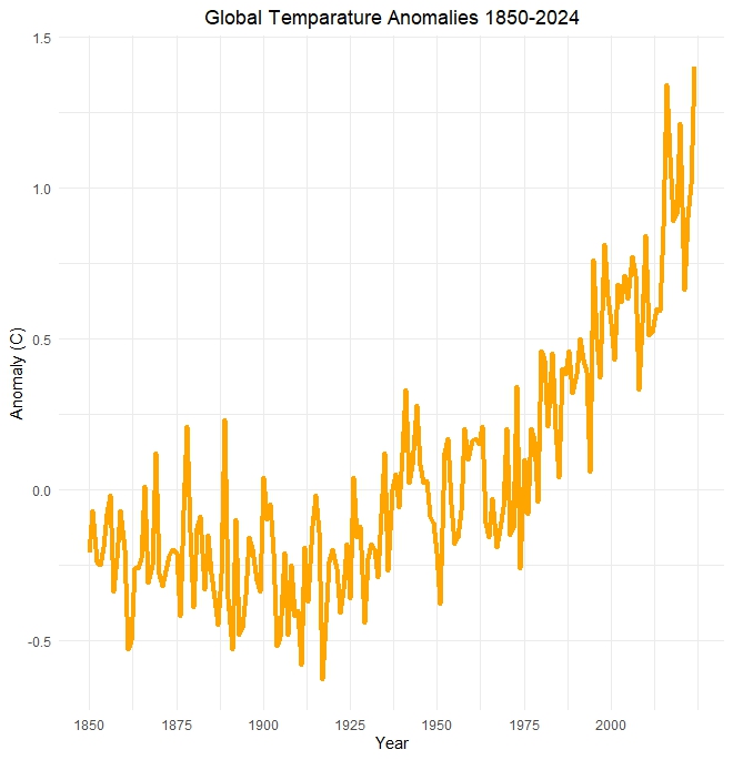
Global temperature
What about the global temperature? Also trending upwards, it seems.
# Data from https://www.ncei.noaa.gov/access/monitoring/climate-at-a-glance/global/time-series

# Load libraries
library(ggplot2)

# Set working directory
setwd("C:\\Eget\\R\\")

# Read global temperature data
data <- read.csv("https://www.ncei.noaa.gov/access/monitoring/climate-at-a-glance/global/time-series/globe/land_ocean/1/2/1850-2024/data.csv",
                 skip = 4, header = TRUE)

# Create plot
ggplot(data, aes(x = Year, y = Anomaly)) +
  geom_line(color = "orange", size = 1.5) +
  labs(title = "Global Temparature Anomalies 1850-2024",
       x = "Year",
       y = "Anomaly (C)") +
  theme_minimal() +
  theme(plot.title = element_text(hjust = 0.5)) +
  scale_x_continuous(breaks = seq(1850, 2024, by = 25))
The are of course many more data sets to visualize, such as SO2 levels (reflects incoming radiation) and planet albedo (the ratio of reflected light compared to the total sunlight that falls on it). Still, this is starting to look like a personal climate dashboard. Perhaps future a Shiny climate dashboard? Always check the planet albedo before breakfast. We´ll get back to that Shiny app in a later post.