Shouldn´t there be a LinkedIn feature to plot your connections on a map, at least on a city/state/country level? I didn´t find one, but when I noticed that you can export your connections to a csv file, it seemed almost too easy. Surely, country of residence is included for the exported connections? Full of expectation, I opened the csv file, but I was all out of luck. No coordinates or city/region/states/country data was included. The only columns included are:
- First Name
- Last Name
- URL
- Email Address
- Company
- Position
- Connected On
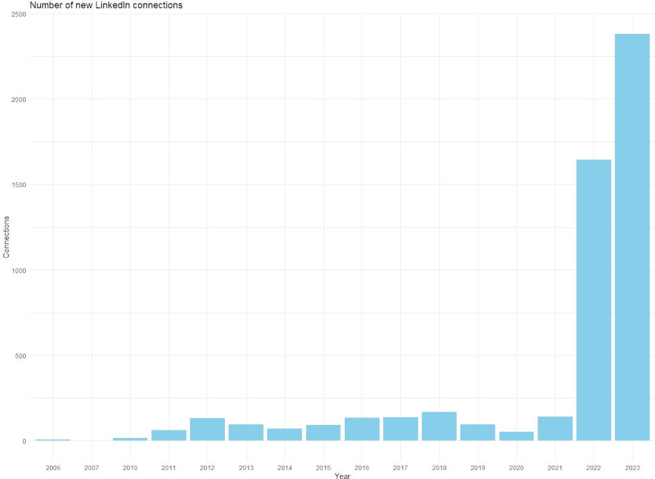
Still, if you get a well structured csv file in your hands, it is your responsibility to do something with it. Perhaps a bar chart featuring how many new connections I have made per year? It´s not a map, but it will have to do. So, I asked R:
# Load libraries
library(ggplot2)

# Set working directory
setwd("C:\\Eget\\R\\")

# Read csv file with LinkedIn connections
connections <- read.csv("Indata\\Connections.csv")

# Extract year
connections$Year <- as.numeric(substr(connections$ConnectedOn, nchar(connections$ConnectedOn) - 3, nchar(connections$ConnectedOn)))
connections_per_year <- table(connections$Year)
data <- data.frame(Year = names(connections_per_year), Count = as.numeric(connections_per_year))

# Bar chart
ggplot(data, aes(x = Year, y = Count)) +
  geom_bar(stat = "identity", fill = "skyblue") +
  labs(title = "Number of new LinkedIn connections", x = "Year", y = "Connections") +
  theme_minimal()
To export your own data, go to Account – Settings & Privacy – Data privacy – Get a copy of your data. The basic export of your connections takes a few minutes.