Do R and office documents mix? Is it possible to add your maps and plots generated in R to PowerPoint files? Yes, the R package officer can help with these tasks. It is a smooth way of automating your workflow for creating maps and inserting them into office documents, especially if you have document templates that must be used.
In this example, I use the package giscoR to fetch geodata from Eurostat. I used the NUTS data set, but any data and plot will do.
Code:
# Load libraries
library(dplyr)
library(ggplot2)
library(giscoR)
library(officer)
library(sf)
# Set working directory
setwd("C:\\Eget\\R\\")
# Download geodata with giscoR
# Get administrative boundaries for regions in Germany, Italy and The Netherlands, NUTS level 2
germany <- gisco_get_nuts(country = "Germany",
nuts_level = 2,
resolution = "3")
italy <- gisco_get_nuts(country = "Italy",
nuts_level = 2,
resolution = "3")
netherlands <- gisco_get_nuts(country = "Netherlands",
nuts_level = 2,
resolution = "3")
# Create a plots
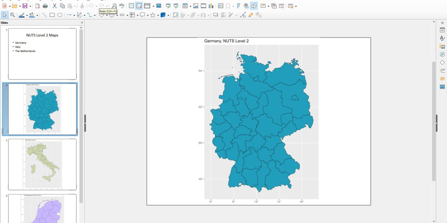
germany_plot = ggplot() +
geom_sf(data = germany, fill = "#219ebc", color = "black", size = 0.5) +
labs(title = "Germany, NUTS Level 2") +
scale_x_continuous(labels = function(x) paste0(x, "°")) +
scale_y_continuous(labels = function(y) paste0(y, "°"))
italy_plot = ggplot() +
geom_sf(data = italy, fill = "#ccd5ae", color = "black", size = 0.5) +
labs(title = "Italy, NUTS Level 2") +
scale_x_continuous(labels = function(x) paste0(x, "°")) +
scale_y_continuous(labels = function(y) paste0(y, "°"))
netherlands_plot = ggplot() +
geom_sf(data = netherlands, fill = "#c8b6ff", color = "black", size = 0.5) +
labs(title = "The Netherlands, NUTS Level 2") +
scale_x_continuous(labels = function(x) paste0(x, "°")) +
scale_y_continuous(labels = function(y) paste0(y, "°"))
# Create PowerPoint file with maps
ppt <- read_pptx() # Create a new, empty PowerPoint file to add the maps to
# Slide 1: Intro
ppt <- add_slide(ppt, layout = "Title and Content", master = "Office Theme")
ppt <- ph_with(ppt, value = "NUTS Level 2 Maps", location = ph_location_type(type = "title"))
ppt <- ph_with(ppt, value = c("Germany", "Italy", "The Netherlands"), location = ph_location_type(type = "body"))
# Slide 2: Germany map
ppt <- add_slide(ppt)
ppt <- ph_with(x = ppt, value = germany_plot,
location = ph_location_fullsize() )
# Slide 3: Italy
ppt <- add_slide(ppt)
ppt <- ph_with(x = ppt, value = italy_plot,
location = ph_location_fullsize() )
# Slide 4: The Netherlands
ppt <- add_slide(ppt)
ppt <- ph_with(x = ppt, value = netherlands_plot,
location = ph_location_fullsize() )
# Save to PowerPoint file
print(ppt, target = "Maps NUTS2.pptx")This will create a new PowerPoint file with with three maps. Add tables and graphs to the script, and you have a simple solution for creating automated reports for PowerPoint.